Data transforms are intended to remove noise and improve the signal in time series forecasting.
It can be very difficult to select a good, or even best, transform for a given prediction problem. There are many transforms to choose from and each has a different mathematical intuition.
In this tutorial, you will discover how to explore different power-based transforms for time series forecasting with Python.
After completing this tutorial, you will know:
- How to identify when to use and how to explore a square root transform.
- How to identify when to use and explore a log transform and the expectations on raw data.
- How to use the Box-Cox transform to perform square root, log, and
automatically discover the best power transform for your dataset.
Airline Passengers Dataset
The Airline Passengers dataset describes a total number of airline passengers over time.
The units are a count of the number of airline passengers in thousands. There are 144 monthly observations from 1949 to 1960.
Download the dataset to your current working directory with the filename “airline-passengers.csv“.
The example below loads the dataset and plots the data.
Running the example creates two plots, the first showing the time series as a line plot and the second showing the observations as a histogram.
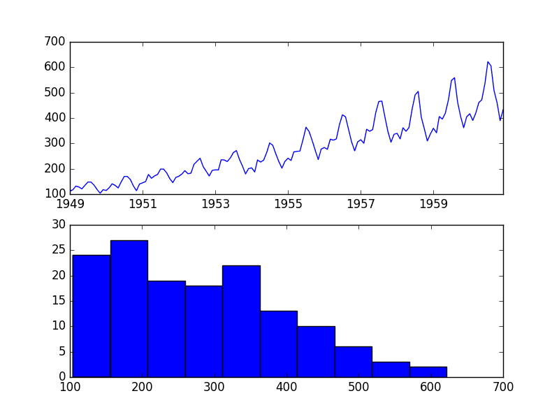
Airline Passengers Dataset Plot
The dataset is non-stationary, meaning that the mean and the variance of the observations change over time. This makes it difficult to model by both classical statistical methods, like ARIMA, and more sophisticated machine learning methods, like neural networks.
This is caused by what appears to be both an increasing trend and a seasonality component.
In addition, the amount of change, or the variance, is increasing with time. This is clear when you look at the size of the seasonal component and notice that from one cycle to the next, the amplitude (from bottom to top of the cycle) is increasing.
In this tutorial, we will investigate transforms that we can use on time series datasets that exhibit this property.
Stop learning Time Series Forecasting the slow way!
Take my free 7-day email course and discover how to get started (with sample code).
Click to sign-up and also get a free PDF Ebook version of the course.
Square Root Transform
A time series that has a quadratic growth trend can be made linear by taking the square root.
Let’s demonstrate this with a quick contrived example.
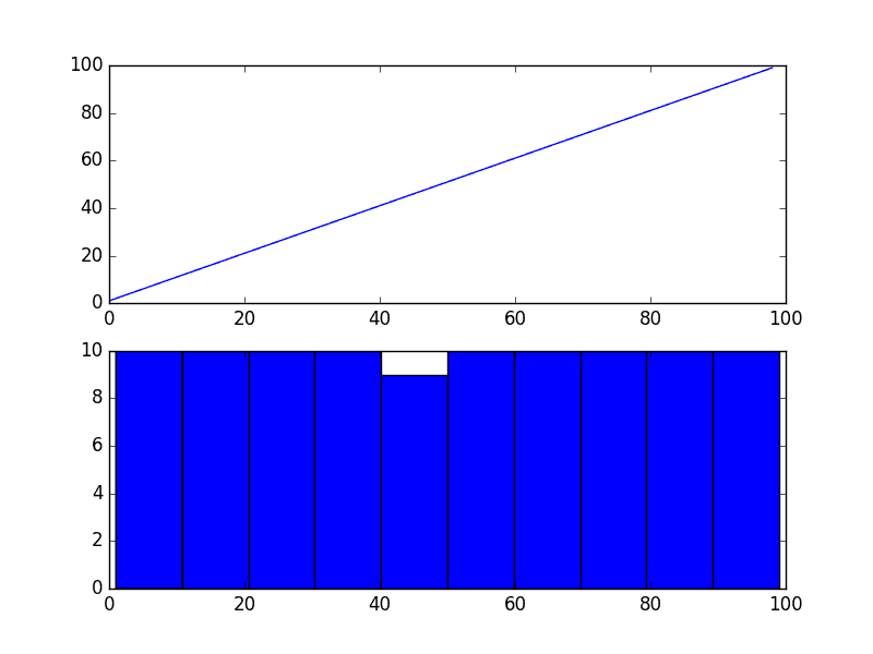
Consider a series of the numbers 1 to 99 squared. The line plot of this series will show a quadratic growth trend and a histogram of the values will show an exponential distribution with a long trail.
The snippet of code below creates and graphs this series.
Running the example plots the series both as a line plot over time and a histogram of observations.
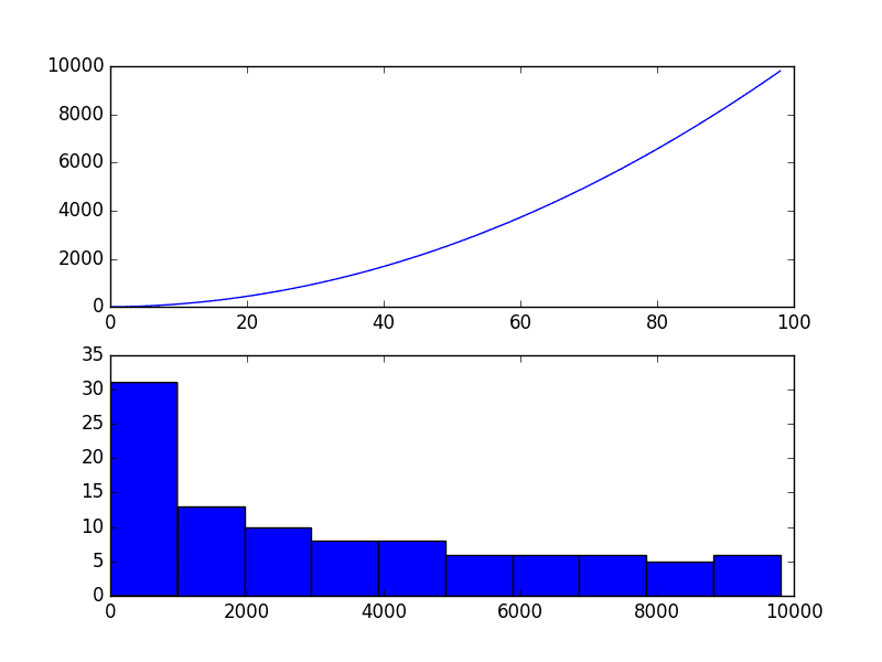
Quadratic Time Series
If you see a structure like this in your own time series, you may have a quadratic growth trend. This can be removed or made linear by taking the inverse operation of the squaring procedure, which is the square root.
Because the example is perfectly quadratic, we would expect the line plot of the transformed data to show a straight line. Because the source of the squared series is linear, we would expect the histogram to show a uniform distribution.
The example below performs a sqrt() transform on the time series and plots the result.
We can see that, as expected, the quadratic trend was made linear.

Square Root Transform of Quadratic Time Series
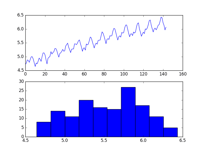
It is possible that the Airline Passengers dataset shows a quadratic growth. If this is the case, then we could expect a square root transform to reduce the growth trend to be linear and change the distribution of observations to be perhaps nearly Gaussian.
The example below performs a square root of the dataset and plots the results.
We can see that the trend was reduced, but was not removed.
The line plot still shows an increasing variance from cycle to cycle. The histogram still shows a long tail to the right of the distribution, suggesting an exponential or long-tail distribution.
Square Root Transform of Airline Passengers Dataset Plot
Log Transform
A class of more extreme trends are exponential, often graphed as a hockey stick.
Time series with an exponential distribution can be made linear by taking the logarithm of the values. This is called a log transform.
As with the square and square root case above, we can demonstrate this with a quick example.
The code below creates an exponential distribution by raising the numbers from 1 to 99 to the value e, which is the base of the natural logarithms or Euler’s number (2.718…).
Running the example creates a line plot of the series and a histogram of the distribution of observations.
We see an extreme increase on the line graph and an equally extreme long tail distribution on the histogram.
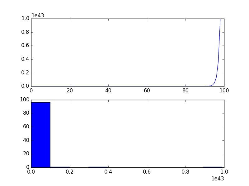
Exponential Time Series
Again, we can transform this series back to linear by taking the natural logarithm of the values.
This would make the series linear and the distribution uniform. The example below demonstrates this for completeness.
Running the example creates plots, showing the expected linear result.
Log Transformed Exponential Time Series
Our Airline Passengers dataset has a distribution of this form, but perhaps not this extreme.
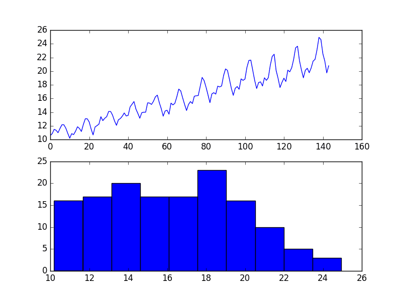
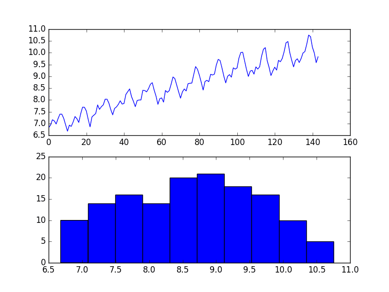
The example below demonstrates a log transform of the Airline Passengers dataset.
Running the example results in a trend that does look a lot more linear than the square root transform above. The line plot shows a seemingly linear growth and variance.
The histogram also shows a more uniform or squashed Gaussian-like distribution of observations.

Log Transform of Airline Passengers Dataset Plot
Log transforms are popular with time series data as they are effective at removing exponential variance.
It is important to note that this operation assumes values are positive and non-zero. It is common to transform observations by adding a fixed constant to ensure all input values meet this requirement. For example:
Where transform is the transformed series, constant is a fixed value that lifts all observations above zero, and x is the time series.
Box-Cox Transform
The square root transform and log transform belong to a class of transforms called power transforms.
The Box-Cox transform is a configurable data transform method that supports both square root and log transform, as well as a suite of related transforms.
More than that, it can be configured to evaluate a suite of transforms automatically and select a best fit. It can be thought of as a power tool to iron out power-based change in your time series. The resulting series may be more linear and the resulting distribution more Gaussian or Uniform, depending on the underlying process that generated it.
The scipy.stats library provides an implementation of the Box-Cox transform. The boxcox() function takes an argument, called lambda, that controls the type of transform to perform.
Below are some common values for lambda
- lambda = -1. is a reciprocal transform.
- lambda = -0.5 is a reciprocal square root transform.
- lambda = 0.0 is a log transform.
- lambda = 0.5 is a square root transform.
- lambda = 1.0 is no transform.
For example, we can perform a log transform using the boxcox() function as follows:
Running the example reproduces the log transform from the previous section.
BoxCox Log Transform of Airline Passengers Dataset Plot
We can set the lambda parameter to None (the default) and let the function find a statistically tuned value.
The following example demonstrates this usage, returning both the transformed dataset and the chosen lambda value.
Running the example discovers the lambda value of 0.148023.
We can see that this is very close to a lambda value of 0.0, resulting in a log transform and stronger (less than) than 0.5 for the square root transform.
The line and histogram plots are also very similar to those from the log transform.
BoxCox Auto Transform of Airline Passengers Dataset Plot
Summary
In this tutorial, you discovered how to identify when to use and how to use different power transforms on time series data with Python.
Specifically, you learned:
- How to identify a quadratic change and use the square root transform.
- How to identify an exponential change and how to use the log transform.
- How to use the Box-Cox transform to perform square root and log transforms and automatically optimize the transform for a dataset.
Do you have any questions about power transforms, or about this tutorial?
Ask your questions in the comments below and I will do my best to answer.


No comments:
Post a Comment