6 Ways to Plot Your Time Series Data with Python
Time series lends itself naturally to visualization.
Line plots of observations over time are popular, but there is a suite of other plots that you can use to learn more about your problem.
The more you learn about your data, the more likely you are to develop a better forecasting model.
In this tutorial, you will discover 6 different types of plots that you can use to visualize time series data with Python.
Specifically, after completing this tutorial, you will know:
- How to explore the temporal structure of time series with line plots, lag plots, and autocorrelation plots.
- How to understand the distribution of observations using histograms and density plots.
- How to tease out the change in distribution over intervals using box and whisker plots and heat map plots
Time Series Visualization
Visualization plays an important role in time series analysis and forecasting.
Plots of the raw sample data can provide valuable diagnostics to identify temporal structures like trends, cycles, and seasonality that can influence the choice of model.
A problem is that many novices in the field of time series forecasting stop with line plots.
In this tutorial, we will take a look at 6 different types of visualizations that you can use on your own time series data. They are:
- Line Plots.
- Histograms and Density Plots.
- Box and Whisker Plots.
- Heat Maps.
- Lag Plots or Scatter Plots.
- Autocorrelation Plots.
The focus is on univariate time series, but the techniques are just as applicable to multivariate time series, when you have more than one observation at each time step.
Next, let’s take a look at the dataset we will use to demonstrate time series visualization in this tutorial.
Minimum Daily Temperatures Dataset
This dataset describes the minimum daily temperatures over 10 years (1981-1990) in the city Melbourne, Australia.
The units are in degrees Celsius and there are 3,650 observations. The source of the data is credited as the Australian Bureau of Meteorology.
Download the dataset and place it in the current working directory with the filename “daily-minimum-temperatures.csv“.
Below is an example of loading the dataset as a Panda Series.
Running the example loads the dataset and prints the first 5 rows.
1. Time Series Line Plot
The first, and perhaps most popular, visualization for time series is the line plot.
In this plot, time is shown on the x-axis with observation values along the y-axis.
Below is an example of visualizing the Pandas Series of the Minimum Daily Temperatures dataset directly as a line plot.
Running the example creates a line plot.
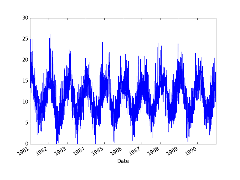
Minimum Daily Temperature Line Plot
The line plot is quite dense.
Sometimes it can help to change the style of the line plot; for example, to use a dashed line or dots.
Below is an example of changing the style of the line to be black dots instead of a connected line (the style=’k.’ argument).
We could change this example to use a dashed line by setting style to be ‘k–‘.
Running the example recreates the same line plot with dots instead of the connected line.
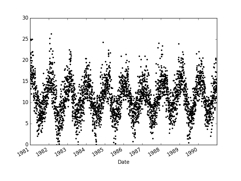
Minimum Daily Temperature Dot Plot
It can be helpful to compare line plots for the same interval, such as from day-to-day, month-to-month, and year-to-year.
The Minimum Daily Temperatures dataset spans 10 years. We can group data by year and create a line plot for each year for direct comparison.
The example below shows how to do this.
The groups are then enumerated and the observations for each year are stored as columns in a new DataFrame.
Finally, a plot of this contrived DataFrame is created with each column visualized as a subplot with legends removed to cut back on the clutter.
Running the example creates 10 line plots, one for each year from 1981 at the top and 1990 at the bottom, where each line plot is 365 days in length.
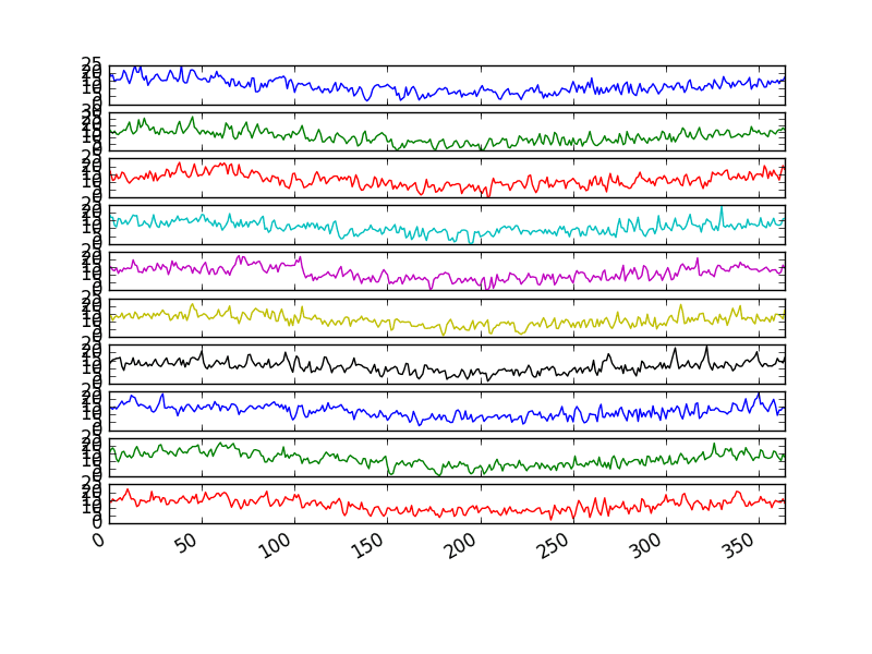
Minimum Daily Temperature Yearly Line Plots
2. Time Series Histogram and Density Plots
Another important visualization is of the distribution of observations themselves.
This means a plot of the values without the temporal ordering.
Some linear time series forecasting methods assume a well-behaved distribution of observations (i.e. a bell curve or normal distribution). This can be explicitly checked using tools like statistical hypothesis tests. But plots can provide a useful first check of the distribution of observations both on raw observations and after any type of data transform has been performed.
The example below creates a histogram plot of the observations in the Minimum Daily Temperatures dataset. A histogram groups values into bins, and the frequency or count of observations in each bin can provide insight into the underlying distribution of the observations.
Running the example shows a distribution that looks strongly Gaussian. The plotting function automatically selects the size of the bins based on the spread of values in the data.
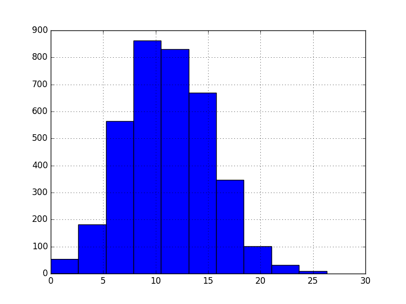
Minimum Daily Temperature Histogram Plot
We can get a better idea of the shape of the distribution of observations by using a density plot.
This is like the histogram, except a function is used to fit the distribution of observations and a nice, smooth line is used to summarize this distribution.
Below is an example of a density plot of the Minimum Daily Temperatures dataset.
Running the example creates a plot that provides a clearer summary of the distribution of observations. We can see that perhaps the distribution is a little asymmetrical and perhaps a little pointy to be Gaussian.
Seeing a distribution like this may suggest later exploring statistical hypothesis tests to formally check if the distribution is Gaussian and perhaps data preparation techniques to reshape the distribution, like the Box-Cox transform.
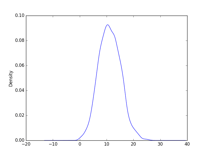
Minimum Daily Temperature Density Plot
3. Time Series Box and Whisker Plots by Interval
Histograms and density plots provide insight into the distribution of all observations, but we may be interested in the distribution of values by time interval.
Another type of plot that is useful to summarize the distribution of observations is the box and whisker plot. This plot draws a box around the 25th and 75th percentiles of the data that captures the middle 50% of observations. A line is drawn at the 50th percentile (the median) and whiskers are drawn above and below the box to summarize the general extents of the observations. Dots are drawn for outliers outside the whiskers or extents of the data.
Box and whisker plots can be created and compared for each interval in a time series, such as years, months, or days.
Below is an example of grouping the Minimum Daily Temperatures dataset by years, as was done above in the plot example. A box and whisker plot is then created for each year and lined up side-by-side for direct comparison.
Comparing box and whisker plots by consistent intervals is a useful tool. Within an interval, it can help to spot outliers (dots above or below the whiskers).
Across intervals, in this case years, we can look for multiple year trends, seasonality, and other structural information that could be modeled.
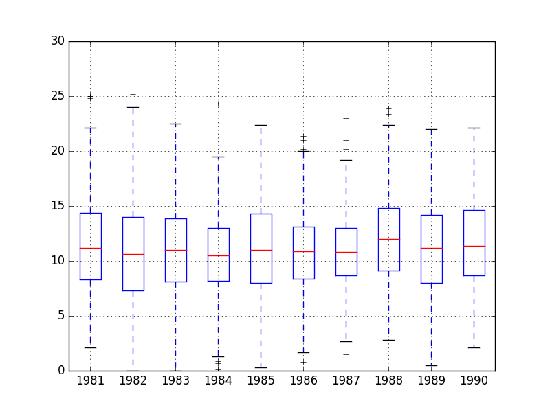
Minimum Daily Temperature Yearly Box and Whisker Plots
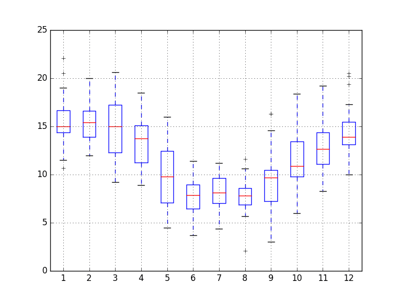
We may also be interested in the distribution of values across months within a year.
The example below creates 12 box and whisker plots, one for each month of 1990, the last year in the dataset.
In the example, first, only observations from 1990 are extracted.
Then, the observations are grouped by month, and each month is added to a new DataFrame as a column.
Finally, a box and whisker plot is created for each month-column in the newly constructed DataFrame.
Running the example creates 12 box and whisker plots, showing the significant change in distribution of minimum temperatures across the months of the year from the Southern Hemisphere summer in January to the Southern Hemisphere winter in the middle of the year, and back to summer again.
Minimum Daily Temperature Monthly Box and Whisker Plots
4. Time Series Heat Maps
A matrix of numbers can be plotted as a surface, where the values in each cell of the matrix are assigned a unique color.
This is called a heatmap, as larger values can be drawn with warmer colors (yellows and reds) and smaller values can be drawn with cooler colors (blues and greens).
Like the box and whisker plots, we can compare observations between intervals using a heat map.
In the case of the Minimum Daily Temperatures, the observations can be arranged into a matrix of year-columns and day-rows, with minimum temperature in the cell for each day. A heat map of this matrix can then be plotted.
Below is an example of creating a heatmap of the Minimum Daily Temperatures data. The matshow() function from the matplotlib library is used as no heatmap support is provided directly in Pandas.
For convenience, the matrix is rotation (transposed) so that each row represents one year and each column one day. This provides a more intuitive, left-to-right layout of the data.
The plot shows the cooler minimum temperatures in the middle days of the years and the warmer minimum temperatures in the start and ends of the years, and all the fading and complexity in between.

Minimum Daily Temperature Yearly Heat Map Plot
As with the box and whisker plot example above, we can also compare the months within a year.
Below is an example of a heat map comparing the months of the year in 1990. Each column represents one month, with rows representing the days of the month from 1 to 31.
Running the example shows the same macro trend seen for each year on the zoomed level of month-to-month.
We can also see some white patches at the bottom of the plot. This is missing data for those months that have fewer than 31 days, with February being quite an outlier with 28 days in 1990.

Minimum Daily Temperature Monthly Heat Map Plot
5. Time Series Lag Scatter Plots
Time series modeling assumes a relationship between an observation and the previous observation.
Previous observations in a time series are called lags, with the observation at the previous time step called lag1, the observation at two time steps ago lag2, and so on.
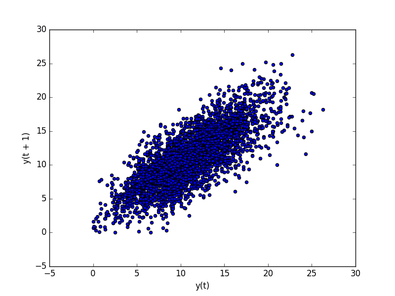
A useful type of plot to explore the relationship between each observation and a lag of that observation is called the scatter plot.
Pandas has a built-in function for exactly this called the lag plot. It plots the observation at time t on the x-axis and the lag1 observation (t-1) on the y-axis.
- If the points cluster along a diagonal line from the bottom-left to the top-right of the plot, it suggests a positive correlation relationship.
- If the points cluster along a diagonal line from the top-left to the bottom-right, it suggests a negative correlation relationship.
- Either relationship is good as they can be modeled.
More points tighter in to the diagonal line suggests a stronger relationship and more spread from the line suggests a weaker relationship.
A ball in the middle or a spread across the plot suggests a weak or no relationship.
Below is an example of a lag plot for the Minimum Daily Temperatures dataset.
The plot created from running the example shows a relatively strong positive correlation between observations and their lag1 values.
Minimum Daily Temperature Lag Plot
We can repeat this process for an observation and any lag values. Perhaps with the observation at the same time last week, last month, or last year, or any other domain-specific knowledge we may wish to explore.
For example, we can create a scatter plot for the observation with each value in the previous seven days. Below is an example of this for the Minimum Daily Temperatures dataset.
First, a new DataFrame is created with the lag values as new columns. The columns are named appropriately. Then a new subplot is created that plots each observation with a different lag value.
Running the example suggests the strongest relationship between an observation with its lag1 value, but generally a good positive correlation with each value in the last week.
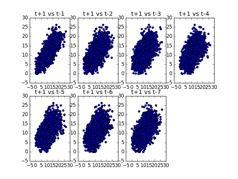
Minimum Daily Temperature Scatter Plots
6. Time Series Autocorrelation Plots
We can quantify the strength and type of relationship between observations and their lags.
In statistics, this is called correlation, and when calculated against lag values in time series, it is called autocorrelation (self-correlation).
A correlation value calculated between two groups of numbers, such as observations and their lag1 values, results in a number between -1 and 1. The sign of this number indicates a negative or positive correlation respectively. A value close to zero suggests a weak correlation, whereas a value closer to -1 or 1 indicates a strong correlation.
Correlation values, called correlation coefficients, can be calculated for each observation and different lag values. Once calculated, a plot can be created to help better understand how this relationship changes over the lag.
This type of plot is called an autocorrelation plot and Pandas provides this capability built in, called the autocorrelation_plot() function.
The example below creates an autocorrelation plot for the Minimum Daily Temperatures dataset:
The resulting plot shows lag along the x-axis and the correlation on the y-axis. Dotted lines are provided that indicate any correlation values above those lines are statistically significant (meaningful).
We can see that for the Minimum Daily Temperatures dataset we see cycles of strong negative and positive correlation. This captures the relationship of an observation with past observations in the same and opposite seasons or times of year. Sine waves like those seen in this example are a strong sign of seasonality in the dataset.
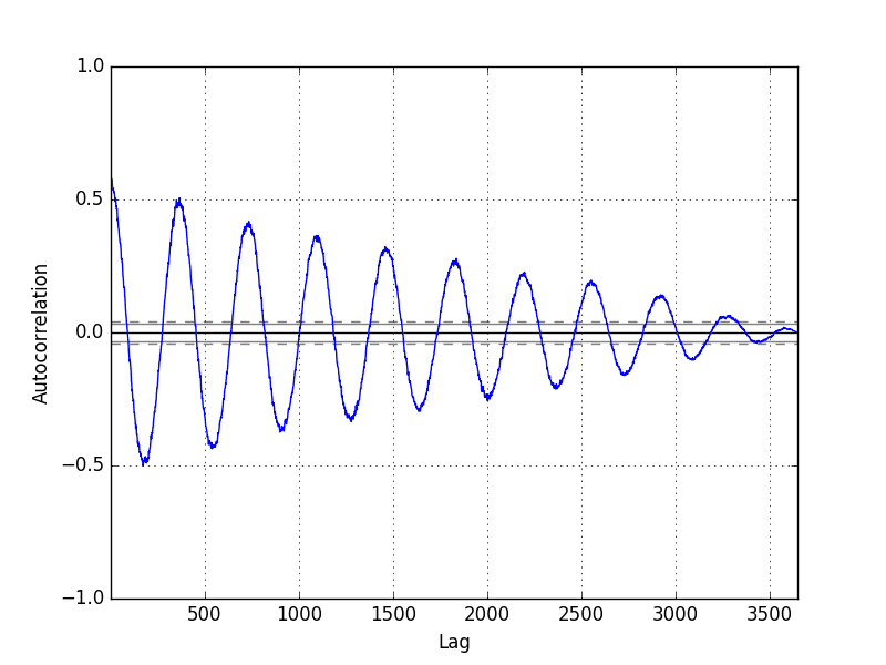
Minimum Daily Temperature Autocorrelation Plot
Further Reading
This section provides some resources for further reading on plotting time series and on the Pandas and Matplotlib functions used in this tutorial.
- Metric graphs 101: Timeseries graphs
- A Tour Through the Visualization Zoo
- Pandas Plotting
- DataFrame Plot Function
Summary
In this tutorial, you discovered how to explore and better understand your time series dataset in Python.
Specifically, you learned:
- How to explore the temporal relationships with line, scatter, and autocorrelation plots.
- How to explore the distribution of observations with histograms and density plots.
- How to explore the change in distribution of observations with box and whisker and heat map plots.
Do you have any questions about plotting time series data, or about this tutorial?
Ask your question in the comments and I will do my best to answer.


No comments:
Post a Comment