It is important to take your time to learn about your data when starting on a new machine learning problem.
There are key things that you can look at to very quickly learn more about your dataset, such as descriptive statistics and data visualizations.
In this post you will discover how you can learn more about your data in the Weka machine learning workbench my reviewing descriptive statistics and visualizations of your data.
After reading this post you will know about:
- The distribution of attributes from reviewing statistical summaries.
- The distribution of attributes from reviewing univariate plots.
- The relationship between attributes from reviewing multivariate plots.
Better Understand Your Data With Descriptive Statistics
The Weka explorer will automatically calculate descriptives statistics for numerical attributes.
- Open The Weka GUI Chooser.
- Click “Explorer” to open the Weka Explorer.
- Load the Pima Indians datasets from data/diabetes.arff
The Pima Indians dataset contains numeric input variables that we can use to demonstrate the calculation of descriptive statistics.
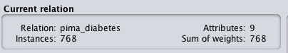
Firstly, note that the dataset summary in the “Current Relation” section. This panel summarizes the following details about the loaded datasets:
- Dataset name (relation).
- The number of rows (instances).
- The number of columns (attributes).
Weka Summary of Dataset
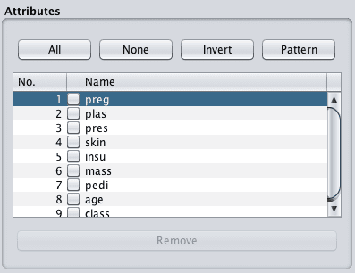
Click on the first attribute in the dataset in the “Attributes” panel.
Weka List of Attributes
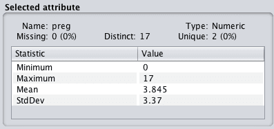
Take note of the details in the “Selected attribute” panel. It lists a lot of information about the selected attribute, such as:
- The name of the attribute.
- The number of missing values and the ratio of missing values across the whole dataset.
- The number of distinct values.
- The data type.
Weka Summary of Attribute
The table below lists a number of descriptive statistics and their values. A useful four number summary is provided for numeric attributes including:
- Minimum value.
- Maximum value.
- Mean value.
- Standard deviation.
You can learn a lot from this information. For example:
- The presence and ratio of missing data can give you an indication of whether or not you need to remove or impute values.
- The mean and standard deviation give you a quantified idea of the spread of data for each attribute.
- The number of distinct values can give you an idea of the granularity of the attribute distribution.
Click the class attribute. This attribute has a nominal type. Review the “Selected attribute panel”.
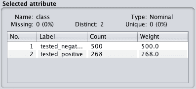
Weka Summary of Class Attribute
We can now see that for nominal attributes that we are provided with a list of each category and the count of instances that belong to each category. There is also mention of weightings, which we can ignore for now. This is used if we want to assign more or less weight to specific attribute values or instances in the dataset.
Need more help with Weka for Machine Learning?
Take my free 14-day email course and discover how to use the platform step-by-step.
Click to sign-up and also get a free PDF Ebook version of the course.
Univariate Attribute Distributions
The distribution of each attribute can be plotted to give a visual qualitative understanding of the distribution.
Weka provides these plots automatically when you select an attribute in the “Preprocess” tab.
We can follow on from the previous section where we already have the Pima Indians dataset loaded.
Click on the “preg” attribute in the “Attributes panel” and note the plot below the “Selected attribute” panel. You will see the distribution of preg values between 0 and 17 along the x-axis. The y-axis shows the count or frequency of values with each preg value.

Weka Univariate Attribute Distribution
Note the red and blue colors referring to the positive and negative classes respectively. The colors are assigned automatically to each categorical value. If there were three categories for the class value, we would see the breakdown of the preg distribution by three colors rather than two.
This is useful to get a quick idea of whether the problem is easily separable for a given attribute, e.g. all the red and blue are cleanly separated for a single attribute. Clicking through each attribute in the list of Attributes and reviewing the plots, we can see that there is no such easy separation of the classes.
We can quickly get an overview of the distribution of all attributes in the dataset and the breakdown of distributions by class by clicking the “Visualize All” button above the univariate plot.

Weka All Univariate Attribute Distributions
Looking at these plots we can see a few interesting things about this dataset.
- It looks like the plas, pres and mass attributes have a nearly Gaussian distribution.
- It looks likes pres, skin, insu and mass have values at 0 that look out of place.
Looking at plots like this and jotting down things that come to mind can give you an idea of further data preparation operations that could be applied (like marking 0 values as corrupt) and even techniques that might be useful (like linear discriminant analysis and logistic regression that assume a Gaussian distribution in input variables).
Visualize Attribute Interactions
So far we have only been looking at the properties of individual features, next we will look at patterns in combinations of attributes.
When attributes are numeric we can create a scatter plot of one attribute against another. This is useful as it can highlight any patterns in the relationship between the attributes, such as positive or negative correlations.
We can create scatter plots for all pairs of input attributes. This is called a scatter plot matrix and reviewing it before modeling your data can shed more light on further preprocessing techniques that you could investigate.
Weka provides a scatter plot matrix for review by default in the “Visualise” tab.

Weka Visualize Tab
Continuing on from the previous section with the Pima Indians dataset loaded, click the “Visualize” tab, and make the window large enough to review all of the individual scatter plots.

Weka Scatterplot Matrix
You can see that all combinations of attributes are plotted in a systematic way. You can also see that each plot appears twice, first in the top left triangle and again in the bottom right triangle with the axes flipped. You can also see a series of plots starting in the bottom left and continuing to the top right where each attribute is plotted against itself. These can be ignored.
Finally, notice that the dots in the scatter plots are colored by their class value. It is good to look for trends or patterns in the dots, such as clear separation of the colors.
Clicking on a plot will give you a new window with the plot that you can further play with.
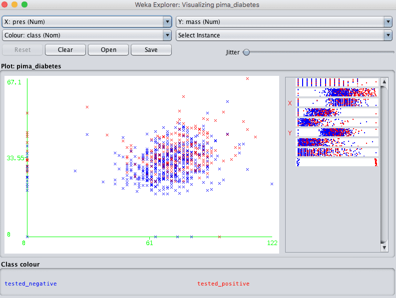
Weka Individual Scatterplot
Note the controls at the bottom of the screen. They let you increase the size of the plots, increase the size of the dots and add jitter.
This last point about jitter is useful when you have a lot of dots overlaying each other and it is hard to see what is going on. Jitter will add some random noise to the data in the plots, spread out the points a bit and help you see what is going on.
When you make a change to these controls, click the “Update” button to apply the changes.
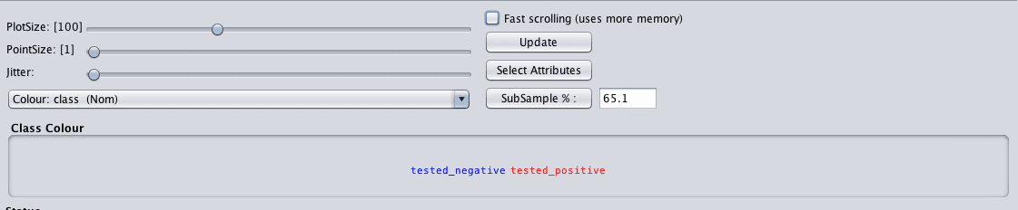
Weka Controls for Scatterplot Matrix
For example, below are the same plots with a larger dot size that makes it easier to see any trends in the data.

Weka Improved Scatterplot Matrix
Summary
In this post you discovered how you can learn more about your machine learning data by reviewing descriptive statistics and data visualizations.
Specifically, you learned:
- That Weka automatically calculates descriptive statistics for each attribute.
- That Weka allows you to review the distribution of each attribute easily.
- That Weka provides a scatter plot visualization to review the pairwise relationships between attributes.
Do you have any questions about descriptive statistics and data visualization in Weka or about this post? Ask your questions in the comments below and I will do my best to answer them.


No comments:
Post a Comment