How do you compare the estimated accuracy of different machine learning algorithms effectively?
In this post you will discover 8 techniques that you can use to compare machine learning algorithms in R.
You can use these techniques to choose the most accurate model, and be able to comment on the statistical significance and the absolute amount it beat out other algorithms.
Choose The Best Machine Learning Model
How do you choose the best model for your problem?
When you work on a machine learning project, you often end up with multiple good models to choose from. Each model will have different performance characteristics.
Using resampling methods like cross validation, you can get an estimate for how accurate each model may be on unseen data. You need to be able to uses the estimates to choose one or two best models from the suite of models that you have created.
Need more Help with R for Machine Learning?
Take my free 14-day email course and discover how to use R on your project (with sample code).
Click to sign-up and also get a free PDF Ebook version of the course.
Compare Machine Learning Models Carefully
When you have a new dataset it is a good idea to visualize the data using a number of different graphing techniques in order to look at the data from different perspectives.
The same idea applies to model selection. You should use a number of different ways of looking at the estimated accuracy of your machine learning algorithms in order to choose the one or two to finalize.
The way that you can do that is to use different visualization methods to show the average accuracy, variance and other properties of the distribution of model accuracies.
In the next section you will discover exactly how you can do that in R.
Compare and Select Machine Learning Models in R
In this section you will discover how you can objectively compare machine learning models in R.
Through the case study in this section you will create a number of machine learning models for the Pima Indians diabetes dataset. You will then use a suite of different visualization techniques to compare the estimated accuracy of the models.
This case study is split up into three sections:
- Prepare Dataset. Load the libraries and dataset ready to train the models.
- Train Models. Train standard machine learning models on the dataset ready for evaluation.
- Compare Models. Compare the trained models using 8 different techniques.
1. Prepare Dataset
The dataset used in this case study is the Pima Indians diabetes dataset, available on the UCI Machine Learning Repository. It is also available in the mlbench package in R.
It is a binary classification problem as to whether a patient will have an onset of diabetes within the next 5 years. The input attributes are numeric and describe medical details for female patients.
Let’s load the libraries and dataset for this case study.
2. Train Models
In this section we will train the 5 machine learning models that we will compare in the next section.
We will use repeated cross validation with 10 folds and 3 repeats, a common standard configuration for comparing models. The evaluation metric is accuracy and kappa because they are easy to interpret.
The algorithms were chosen semi-randomly for their diversity of representation and learning style. They include:
- Classification and Regression Trees
- Linear Discriminant Analysis
- Support Vector Machine with Radial Basis Function
- k-Nearest Neighbors
- Random forest
After the models are trained, they are added to a list and resamples() is called on the list of models. This function checks that the models are comparable and that they used the same training scheme (trainControl configuration). This object contains the evaluation metrics for each fold and each repeat for each algorithm to be evaluated.
The functions that we use in the next section all expect an object with this data.
3. Compare Models
In this section we will look at 8 different techniques for comparing the estimated accuracy of the constructed models.
Table Summary
This is the easiest comparison that you can do, simply call the summary function() and pass it the resamples result. It will create a table with one algorithm for each row and evaluation metrics for each column. In this case we have sorted.
I find it useful to look at the mean and the max columns.
Box and Whisker Plots
This is a useful way to look at the spread of the estimated accuracies for different methods and how they relate.
Note that the boxes are ordered from highest to lowest mean accuracy. I find it useful to look at the mean values (dots) and the overlaps of the boxes (middle 50% of results).
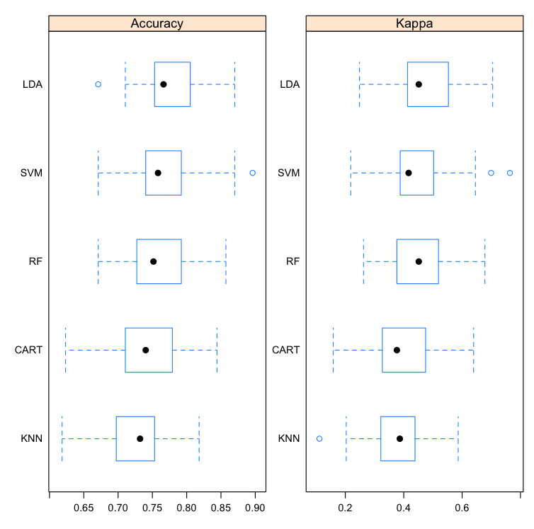
Compare Machine Learning Algorithms in R Box and Whisker Plots
Density Plots
You can show the distribution of model accuracy as density plots. This is a useful way to evaluate the overlap in the estimated behavior of algorithms.
I like to look at the differences in the peaks as well as the spread or base of the distributions.
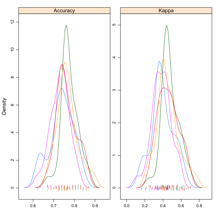
Compare Machine Learning Algorithms in R Density Plots
Dot Plots
These are useful plots as the show both the mean estimated accuracy as well as the 95% confidence interval (e.g. the range in which 95% of observed scores fell).
I find it useful to compare the means and eye-ball the overlap of the spreads between algorithms.
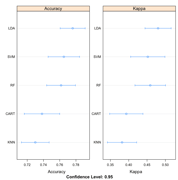
Compare Machine Learning Algorithms in R Dot Plots
Parallel Plots
This is another way to look at the data. It shows how each trial of each cross validation fold behaved for each of the algorithms tested. It can help you see how those hold-out subsets that were difficult for one algorithms faired for other algorithms.
This can be a trick one to interpret. I like to think that this can be helpful in thinking about how different methods could be combined in an ensemble prediction (e.g. stacking) at a later time, especially if you see correlated movements in opposite directions.
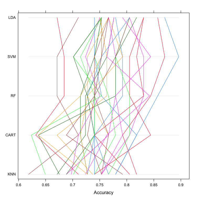
Compare Machine Learning Algorithms in R Parallel Plots
Scatterplot Matrix
This create a scatterplot matrix of all fold-trial results for an algorithm compared to the same fold-trial results for all other algorithms. All pairs are compared.
This is invaluable when considering whether the predictions from two different algorithms are correlated. If weakly correlated, they are good candidates for being combined in an ensemble prediction.
For example, eye-balling the graphs it looks like LDA and SVM look strongly correlated, as does SVM and RF. SVM and CART look weekly correlated.
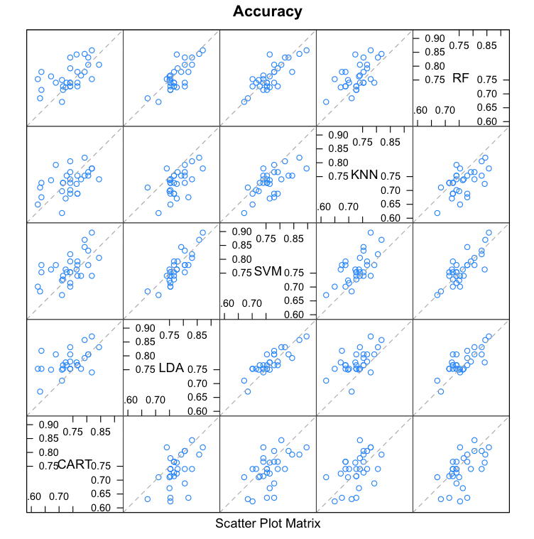
Compare Machine Learning Algorithms in R Scatterplot Matrix
Pairwise xyPlots
You can zoom in on one pair-wise comparison of the accuracy of trial-folds for two machine learning algorithms with an xyplot.
In this case we can see the seemingly correlated accuracy of the LDA and SVM models.
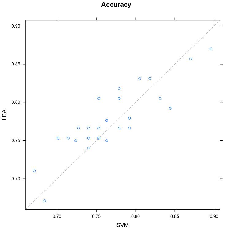
Compare Machine Learning Algorithms in R Pair-wise Scatterplot
Statistical Significance Tests
You can calculate the significance of the differences between the metric distributions of different machine learning algorithms. We can summarize the results directly by calling the summary() function.
We can see a table of pair-wise statistical significance scores. The lower diagonal of the table shows p-values for the null hypothesis (distributions are the same), smaller is better. We can see no difference between CART and kNN, we can also see little difference between the distributions for LDA and SVM.
The upper diagonal of the table shows the estimated difference between the distributions. If we think that LDA is the most accurate model from looking at the previous graphs, we can get an estimate of how much better than specific other models in terms of absolute accuracy.
These scores can help with any accuracy claims you might want to make between specific algorithms.
A good tip is to increase the number of trials to increase the size of the populations and perhaps more precise p values. You can also plot the differences, but I find the plots a lot less useful than the above summary table.
Summary
In this post you discovered 8 different techniques that you can use compare the estimated accuracy of your machine learning models in R.
The 8 techniques you discovered were:
- Table Summary
- Box and Whisker Plots
- Density Plots
- Dot Plots
- Parallel Plots
- Scatterplot Matrix
- Pairwise xyPlots
- Statistical Significance Tests
Did I miss one of your favorite ways to compare the estimated accuracy of machine learning algorithms in R? Leave a comment, I’d love to hear about it!
Next Step
Did you try out these recipes?
- Start your R interactive environment.
- Type or copy-paste the recipes above and try them out.
- Use the built-in help in R to learn more about the functions used.
Do you have a question. Ask it in the comments and I will do my best to answer it.


No comments:
Post a Comment